ADI Client Onboarding

Unlocking hundreds of thousands in lost revenue and improving customer experience through a redesigned onboarding process.

introduction

About the Project

I collaborated with Web, Credit, and Sales teams to redesign onboarding to enhance departmental coordination, improve wait times, and improve customer experience.

client

ADI Global Distribution is the distribution wing of Resideo, a Fortune-1000 worldwide wholesale distributor of security, networking, and Pro A/V products.

The challenge

The existing customer onboarding system was poorly organized and lacked standardization, leading to longer wait times, lost sales, and a poor first impression for new clients.

skills & methodology

Skills: User research & interviews, data analysis, affinity mapping, journey mapping, layout design, prototyping

Tools & Methodology: Figma, Miro, Perplexity AI, modified double diamond process

timeline & team

6 months from concept to handoff

National Head of Sales

Digital Marketing & E-Commerce Manager

1 Web Developer

My role: Sole product designer

results

  • Onboarding time reduced by 3.9 days from application to account activation
  • 73% reduction in SPAM or unqualified applications
  • Fewer questions and easier handoff reported by the Inside Sales and Credit teams

THE CHALLENGE

Why are we doing this?

There were several indications that something was wrong with the existing onboarding process:

Low Completion Rates

Only an estimated 10-30% of applications resulted in an activated account.

Long Wait Times

Most accounts took over a week to activate, with some waiting up to a month.

Unclear Communication

Frequent questions and missed steps highlighted communication gaps in the process.

Lost Sales

Sales staff were reporting lost sales due to the prolonged and convoluted onboarding process.

RESEARCH

Understanding the Problem

The process was chaotic and inefficient, with no standard operating procedure, leading to inconsistent customer experiences.

Research Methods & Challenges

challenge #1

Selection Bias

description

I could only contact clients who had already had accounts

SOLUTION: INTERVIEWS

I interviewed staff and credit team members across different departments to understand common questions and problems and pinpoint where applications failed.

challenge #2

Limited Data

description

The company didn't track form analytics or completion rates, so I needed to estimate that information myself.

solution: qualitative analysis

I examined emails and account metadata to map the process and timeline, despite lacking analytics.

🧑‍🦰

Dou, Jr. Inside Sales Rep

Recently took on account onboarding as a job duty

👱‍♀️

Sarah, Sr. Inside Sales

Fields questions about application status from customers

👨‍🦱

Dave, Branch Manager

Approves applications for account setup

👴

Doug, National Head of Sales

Oversees overall client experience and bringing in new customers

👩‍🦰

Rochelle, Sales Manager

Manages customer escalations and issues within the application process

👩‍🦰

David, Sr. Credit Analyst

Reviews credit applications and granting lines of credit

Piecing Together User Journeys

By combining data and interview feedback, I pieced together the typical journey to gaining an account, including customer, employee, and automated system actions:

Some Key Takeaways:
  • Notice the part outlined in in orange? Over 70% of applications don't make it past there.
  • This user journey uses no CRM or centralized software; all applications are managed and handed off between staff members as email threads.
  • Notice the transfers between roles (staff, customer, and system), especially early on. Each transfer causes delays.
  • Almost none of this process is automated, increasing the mental load for staff members.

Problems Unveiled by Journey Mapping

While conducting interviews, it became clear that the staffs' experience handling applications was a root cause of customer pain points.

For example:

  • One staff member told me that she sometimes confused one application for another and would send an update to the wrong customer
  • Another said they found handling several applications at a time overwhelming, so he procrastinated answering them.

I pried for more details on what bothered them, and then created affinity maps to sort pain points into 4 main themes:

The process is so disorganized and overwhelming. Most of the time, I put it off.

- Junior sales associate

We get so many SPAM applications, and good leads are kept waiting while we figure out who's who.

- Branch manager

There's so many redundant steps. If we got rid of them, it would speed things up a lot.

- Credit analyst

COMMUNICATION
  • Lack of communication (eligiblity, processing time, documentation, etc)
  • Confusingly-worded web copy
ORGANIZATION
  • Data scattered across platforms
  • Poor coordination between parties
COGNITIVE FRICTION
  • Web form UI causing friction
  • Finding & uploading hard copies of documents
PROCESS EFFICIENCY
  • Lack of automation causing a bottleneck
  • No SOP or resources (eg email macros) increasing the mental load
  • Redundant steps

With research completed, I arrived at a clear problem statement:

problem  statement

The onboarding process shapes the customer's first impression of ADI.

This essential component of customer acquisition must be redesigned to improve experience for both staff and end users.

design: part i

Designing the User Journey

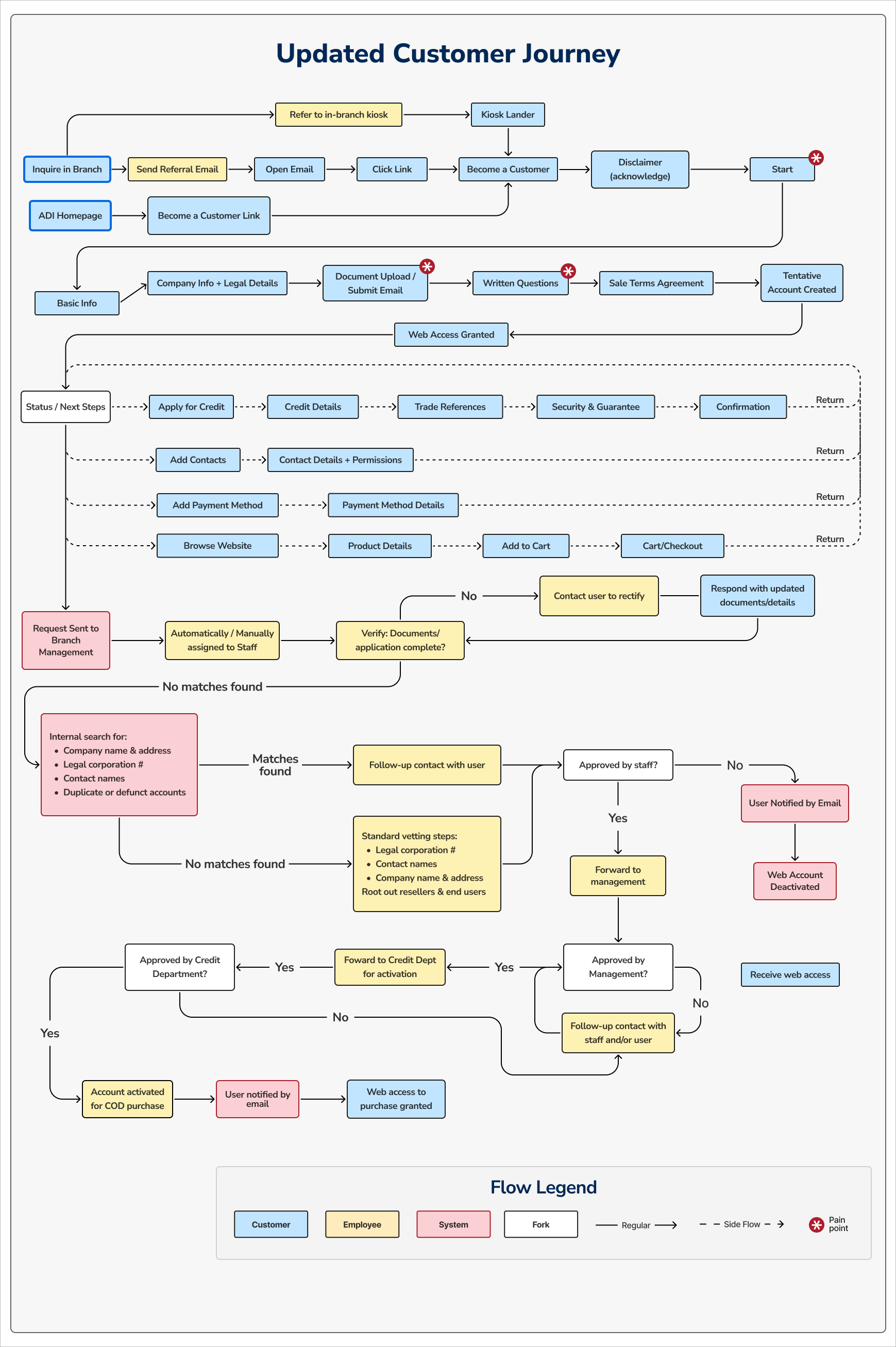
The user flow was redesigned with input from the Credit, Web and Sales teams.

Strategy behind the redesign:

  • Front-loading the user flow.
    This significantly reduces hand-off between parties (a major cause of delays), and requires users to provide their documentation upfront, discouraging ineligible applicants.
  • Supplemental or optional stages of the user flow (like applying for credit or adding contacts) moved to the end to reduce overwhelm and give users something to do while their application was under consideration
  • Conditional Logic to Prioritize Users
    Users who requested a quote over a certain threshold from the website after applying were flagged for prioritization, to avoid losing time-sensitive orders.
  • Short Answer Question
    Requiring a "human element" will help staff to identify qualified applications and flag those filled by bots or AI.

This was the final result:

design: part 2

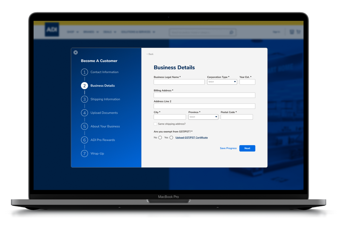
Designing the Customer-Facing UI

The UI redesign carried a strong rationale as well:

  • "Bite-sized" process:
    By breaking the form down into many smaller steps, we could improve engagement and reduce errors
  • Communicate Requirements:
    Use UI elements to set clear expectations and communicate steps

Choosing Layout Options

Competitors had similarly bare-bones onboarding structures, so I used Mobbin to explore onboarding flows from other industries' UI for inspiration.

I explored a few different options for the user flow:

Organization

Establishing a way for staff to organize, track, and find

Efficiency

Eliminating redundancies and finding opportunities for automation

Strategic friction